Intro
By popular demand: my first thoughts on my Kindle Touch 3G (no ads), which arrived just hours ago at my front door.
First of all, I bought this device entirely out of curiosity and love for Kindles – my second generation Kindle is now 2 years old, still fully functioning, and a hardworking companion. I almost feel like I’m cheating on the poor thing. I’ll probably still keep it for reading around the house. We’ve bonded, the little Kindle and I.
But I’ve skipped one generation of Kindles and was filled with curiosity about the new experience. I adore my old Kindle and it changed the way I read (and the way I live, a little bit) – I highly recommend them in whatever form they take. It’s hard to get 2 years in on a device and be as happy with it as the day you bought it, but that’s how I feel about my first Kindle.
However, I’m not excited about the Fire because e-Ink is the game changer for me. Monthlong battery life and low eyestrain make far more difference to me than color. And most of what the Fire can do I get from my Windows Phone, though on a smaller screen. I got the Touch because – well, my keyboard-based model is still working so I don’t need another one of those. It appears that my friends are all curious about the device, and it’s only about a week since its release, so here’s an early-adopter perspective for those considering a Christmas purchase.
Out of Box Experience
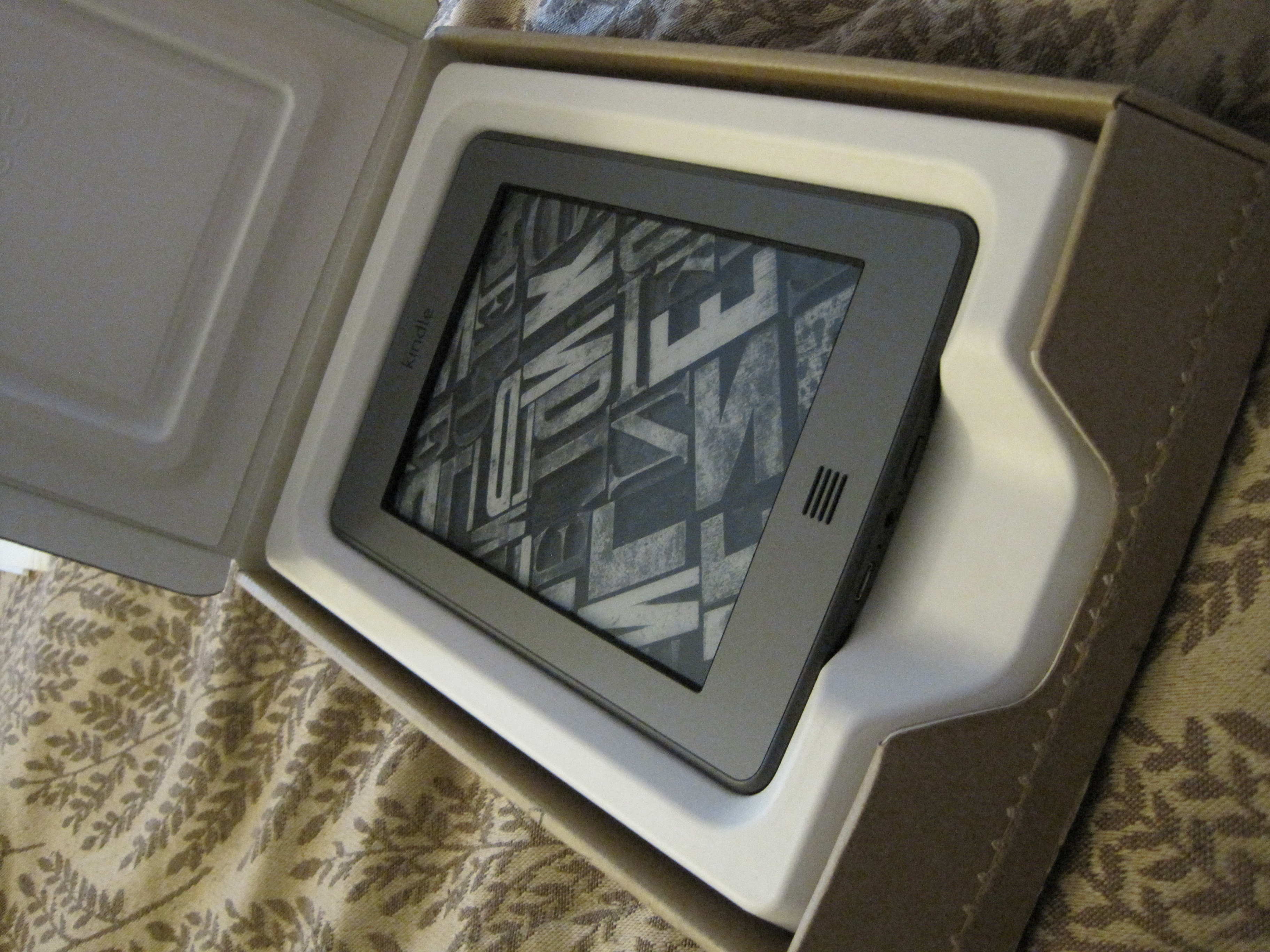
The packaging is small and elegant. As with the last Kindle, the package opens via a zip tab. Now, though, the entirety of the packed-in documentation is a single card regarding connecting the Kindle to a PC. Another change: no A/C adaptor. For those with older Kindles, this is no big deal – and it’s a standard USB->AC connector at any rate, so even my phone charger works.

The device is rather elegant and minimalistic. The body is soft, matte silver with a darker silver contrast trim. When I first held the device I was flabbergasted by how small it was – I’m so used to that 2nd gen keyboard that the Touch feels almost impossibly small, as if some crucial piece were missing. The Home button and the lock/power button are the only two hardware controls on the entire device. There are also two ports: a micro-USB connector, and a mini-headphone jack — plus small onboard speakers built into the lower back panel.
As with all Kindles, devices ordered from Amazon are pre-configured with your account information, so I had immediate access to all of the books in my archive (100+, as it turns out).
Using the Device
I immediately prefer the new unlock button because it’s not a switch like my 2nd gen Kindle. I’ve had bad experiences with that sort of switch everywhere else (coughiPhonecough), and I’m always worried it’ll malfunction. It never did, but it felt like it might. And sometimes you’d fail to push the switch all the way, which was a minor inconvenience.
It’s going to take some getting used to touching the screen, after years of fighting the instinct to touch the screen of my older Kindle. It feels forbidden. The device boots into a 3-page minitutorial on the key touch regions (top = menu, left sidebar = back, everything else = forward).
The “home” button looked like a speaker at first, so it took me a few seconds and some reading to figure out what the hell they were referencing.
The first UX conundrum I encountered was while browsing my archive. I wanted to use the “next page” action as I would have on the old device, but that just triggered downloading whatever archived item was under my thumb when I made contact. Turns out that the scrolling gesture (down->up) is the way to go when navigating lists, which is a change from the permanently paged metaphor in older Kindles.
The second conundrum is how to access book options without opening the book, and this is where the ubiquitous tap-and-hold interaction comes into play. If you have an iPhone or iPad you’ve used this to move icons around, but it’s more heavily used here. More akin to the (more awesome 😉 Windows Phone 7 interface which uses tap-and-hold frequently without providing visual clues.
The Reading Experience
Page loads are much faster and less jarring than older Kindles, and as you might expect the contrast is very good. As mentioned before, the screen is divided into these “Easy-Reach” zones for quick nav with single taps, but swiping left or right also works to navigate pages. I’m not sure which I’ll end up preferring.
Resizing the text is accomplished using the multi-touch pinching gesture, but it doesn’t work in a continuum like an iPhone pinch-to-zoom. Instead, the pinch is interpreted as a request to either zoom in 1 level or out 1 level. At the same time, the text size option menu displays in case you wanted to zoom more than one level in either direction, so you only ever need to pinch once to resize to any size.
Single-tapping doesn’t work to select words for highlighting since that action is assigned to the Easy Reach controls. Instead, you must touch and hold to highlight a single word. After a second or two, a popup appears with the word’s definition and a few options (Highlight, Note, and Share.) To highlight a passage, tap and hold, then drag without lifting your finger once the highlight appears.
At any time, tapping the upper 20% of the screen calls up the UI, with the familiar header bar (smaller now, with a black BG) and options: Back, a cart icon to jump to the store, a search field, and Menu button. The Menu option provides access to wireless controls, sync, text-to-speech, and book navigation.
When the UI is showing, there are also three quick options at the bottom:
– A Fonts menu with font sizing AND spacing controls, plus the option for serif or sans serif fonts (a little designer love up in the Kindle house!)
– “Go To” button for quick navigation (Cover, Beginning, TOC, End, or Location)
– And a Sync button, which is pretty self-explanatory.
Search & Shop
By calling up the UI, a single tap on the Search field will call up the soft keyboard for text entry. The keys are small, just FYI – but at least it’s reasonably responsive. I did notice some onscreen shadowing when moving from the keyboard to a list of items; hopefully that’s just a temporary issue.
But searching from the Home screen only searches your local documents and your archives, not the store. I’m actually pleased with this – makes the archive more seamless and a better storage option.
To shop, you must click on the little cart to open the store. From a purist perspective I don’t like using the cart as a store icon, since it has such strong direct purchasing connotations – I feel like the Amazon “a” would have been a better choice. But it’s not a dealbreaker.
The store experience is much better with touch – on older Kindles it got very tricky navigating with that little joystick thingie. And I have tiny hands (seriously, child-sized; my ring size is a 4. They don’t sell grown-up rings in size 4) so I have no idea how normal adults got on.
Response is still a little slow (I’m connected via 3G, not Wi-Fi) but not worse than before when pulling titles or bestseller lists. New to the Touch is the option to view lists as lists of titles (traditional) or cover thumbnails with star ratings underneath.
Closing
The device seems well-made and a big (largely incremental) improvement. My main concerns are screen wear (will touching make the screen gooey and hard to read over time?) and long-term performance. I haven’t tried that whole “x-ray” research feature yet – I’ll post more here as I explore more. I will be traveling with the device shortly so that should put it properly through its paces…
If you’re buying a new Kindle, I think this is by far the best option if you can spring for the top-of-the line. Classy and easy to use with incredible battery life.
But at the same time it’s not SO groundbreaking that you need to replace your old Kindle as long as it’s still working. If you have a Kindle you’re happy with, wait till the holiday rush dies down. If you’re in the market for a new device or are a gadget addict like me, better put in your order before Thanksgiving or you may regret it. 😉
